This wine looks good
 Maclean’s tells the story of Canadian wine from coast to coast in words and pictures in Wine in Canada: A Tour of Wine Country. Look for it on newsstands now. Or download the app now. In the meantime, here’s a sneak peek:
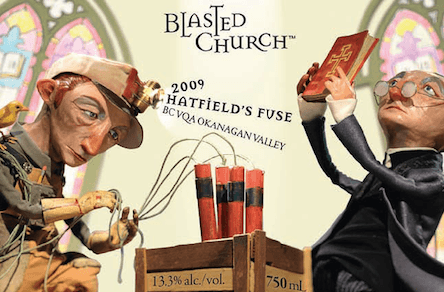
For more than a decade, Bernie Hadley-Beauregard has been rattling the fossilized cage of the Canadian wine establishment while cementing his name as the go-to guy for provocative and distinctive wine labels. His Vancouver-based consultancy, Brandever Strategy Inc., exploded on the scene, so to speak, in 2002, when Evelyn and Chris Campbell hired him to rebrand Prpich Hills, the difficult-to-pronounce Okanagan Valley winery they’d just purchased. Hadley-Beauregard had his “Eureka!” moment researching in a local museum when he came across a reference to the town’s “dynamite church,” so-called because explosives were used to loosen its nails before it was moved from another location in 1929.
Thus the Blasted Church brand was born, though not before labyrinthine regulatory hurdles gave the competition a peek at the whimsical, ecclesiastically themed labels—and a chance to tsk-tsk. “The powers-that-be forecast it was never going to happen,” Hadley-Beauregard says. “They didn’t like the name, or the aesthetics.”
That the brand’s playful irreverence raised old-guard shackles isn’t surprising. Traditionally, wine labels are sober, tasteful indicators of what, where, and when. Of course, no one quibbles when venerable Château Mouton Rothschild commissions renowned artists to design its labels, as it has done every year since 1945 (1988 boasts a cartoony ram by Keith Haring). But other attention-grabbing imagery is viewed as gimmicky, denoting under-$10 tipples. More dangerous, in a wine firmament still governed by a Prohibition ethos, it presents the libation as fun. As for injecting irony, forget it. “It’s an industry with a lot of gravitas,” says Hadley-Beauregard.
In time, however, the Blasted Church skeptics were silenced: the label generated buzz and won international design and marketing awards; the wines garnered glowing reviews and a faithful following. It was the launching pad for the 52-year-old Montreal native, who holds an M.B.A. from McGill University and was a self-described “suit” in consumer-goods packaging before he made the leap to the creative side. Hadley-Beauregard, who works with an international roster of freelancers, clearly thrives on pushing boundaries. (The Hard Row to Hoe label for the Lake Chelan, Wash., winery, for instance, was inspired by lore involving ladies of the night, a local mine and a water taxi.) But Brandever’s portfolio displays range: an elegant, embossed label for the Legacy, a wine by B.C.’s Poplar Grove Winery and a chatty, script-driven label for Small Talk Vineyards in Niagara-on-the-Lake, Ont. Commissions now come from California, South America, New Zealand, even France. Twenty of Brandever’s labels were included in the San Francisco Museum of Modern Art’s 2011 exhibit on the visual culture of wine.
Related Posts

Heated Rivalry Is Anti-Dystopia Art

How the Olympics Remade Montreal
And that culture is evolving, as a generation raised on South Park tries to cut through the viniferous clutter. Hadley-Beauregard jokingly refers to wine-store shelves as “the wailing wall”: “Most wines go by family name, so it’s like trying to memorize the phone book.” His goal is to forge a consumer connection via a memorable name and a compelling narrative that sparks curiosity and conversation. “Since 98 per cent of consumers never visit the winery, their bonding with the wine has to take place in the store,” he says. And so the chalkboard-inspired packaging for B.C. winery Nagging Doubt boasts a QR code that, when scanned with a smartphone, transmits a video of the artist drawing the label.
In 2008, the well-known Niagara winery owner John Howard hired Hadley-Beauregard to come up with the Megalomaniac brand. The egocentric theme, represented by a silhouetted man in a bowler hat, extends to varietal descriptors: Son of a Bitch pinot noir nods to the grape’s temperament; Narcissus riesling’s foil-stamped label and reversed type mimics a mirror. Howard, a satisfied client, calls the Brandever team “Newtonian genii.”
In 2011, they launched the Megalomaniac Homegrown sub-brand to appeal to locavores, and to take a shot at the “Cellared in Canada” designation, that Orwellian label-speak denoting wines made with non-Canadian bulk grapes. Howard says the concept, which features a silhouetted man with a map and GPS location, faced resistance from the big players at first.
Brandever is used to it. In 2007, the Liquor Control Board of Ontario (LCBO) rejected its “Organized Crime” name for a new Niagara boutique winery on the grounds it appeared to condone illicit business. When Hadley-Beauregard countered with a letter pointing to a slew of similar names on the shelves, among them Bacardi’s Rum Runner and Three Thieves Bandit Wines, the agency backed down. Now he’s working on Skinny Dip wine for B.C.’s Monster Vineyard, and is expecting blowback due to an obscure law banning depiction of frontal nudity on labels. He sighs. “Consumers who walk into liquor stores are adults.”
Moray Tawse, owner of Niagara’s Tawse Winery, hired Brandever last year to name and design a new $14 riesling brand due in the LCBO this spring. “We wanted to appeal to younger buyers who purchase on price but want to learn more,” Tawse says. He was so pleased by the resulting Brickyard name, illustration, and backstory that he hired the firm to create imagery for his new winery, Redstone, which will open in 2014. But packaging can only do so much, Tawse cautions. “If you don’t like what’s in the bottle, you won’t buy it again.” True, but as Hadley-Beauregard’s success shows, we’re now drinking in what’s on the bottle, too.
Related Posts

The Golden Age of Smut
How to Win the Westminster Dog Show

Canada’s Indiana Jones

How My Book, Heated Rivalry, Became A TV Phenomenon
Get the Best of Maclean’s straight to your inbox.
Sign up for news, commentary and analysis. Join 60,000+ Canadian readers.