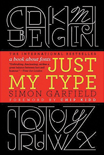
 Somewhere at the bottom of the River Thames lies a font. Thomas Cobden-Sanderson, creator of the typeface known as Doves—first seen in the 1902 Doves Bible—was fearful that after his death the font could be used to print objectionable material or in sloppy printing jobs he wouldn’t be on hand to oversee. Instead of abiding by a legal agreement to leave the font to his business partner, Cobden-Sanderson, over a three-year period, threw the blocks of Doves type off the Hammersmith Bridge until there were none left. In an age of hand-cut typeface, Doves was forever lost.
Who knew someone could feel so strongly about something most of us take for granted? Garfield points out that we are surrounded by fonts, on storefronts, clothing labels, elevator buttons—you’re looking at one right now—and lightheartedly shows us that behind the scenes of what he calls “the uncelebrated hardware of our language” lies a rich history that, at times, can border on soap opera.
There are font pirates, font thefts and font controversies, as when Ikea abandoned Futura for Verdana. There is even font hijacking: the Obama campaign tapped Gotham, designed by Tobias Frere-Jones, during its 2008 campaign, and Hope and Change never looked so good; much to Frere-Jones’s chagrin, Sarah Palin and other Tea Party activists later adopted his font. If only Frere-Jones could throw Gotham off the Brooklyn Bridge—but that would be a lot of computers.
What font should you use to break up with someone? Why did the Nazis ban Gothic script? What does an ampersand actually stand for? These questions and more are enthusiastically answered by Garfield, who obviously cherishes his subject matter. His description of the capital “Q” in the Bakersville typeface, “the tail almost underlines the u, cupping it with tenderness,” practically brings a tear to the eye.