So this is what data transparency on COVID-19 looks like
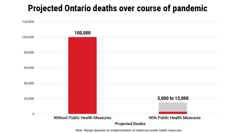
Patricia Treble: If there is one chart that should be sent to everyone in Ontario, it’s the forecasts for the death toll in the province

(SOURCE: COVID-19 Modelling, April 3, 2020, Government of Ontario)
Share
For the last three weeks, Canadians have struggled to get a handle on just how serious the COVID-19 epidemic was and how much self-sacrifice would be required to get it under control. Sure, we could see the death tolls in Italy and the United States, but it didn’t seem real. In part, that’s because Canada has a terrible reputation when it comes to data. It’s frustratingly hard to get, annoyingly difficult to compare and infuriatingly complicated to use to map trends. Even while shutting down the nation, federal officials refused to provide historical numbers so everyone could see how Canada’s curve was remorselessly increasing.
Only this week did all provinces and territories post regularly updated testing data on their public websites. Indeed, just a few days ago, Ontario actually removed statistics on its huge COVID-19 testing backlog, only to backtrack and put it back online after an outcry on social media.
READ: Coronavirus in Canada: These charts show how our fight to ‘flatten the curve’ is going
Governments in Canada have long been complacent, keeping data to themselves, refusing to understand why the public and media would ever want to see such numbers. It took days of public pressure until Premier Doug Ford announced on Thursday that the province would release the data: “You deserve to know what I know when you’re making decisions for yourself, your family and your community,” he said.
Sure, they are preliminary numbers. Sure, the data will change every day, every week as the number of confirmed cases climb, as the death toll mounts and Canadians decide just how seriously they want to follow the advice of public health experts. But perhaps, just perhaps, the numbers in Ontario’s modelling will be a wake-up call to everyone playing touch football in parks, or gathering for street meals in neighbourhoods.
If there is one chart that should be sent to everyone in Ontario, it’s the forecasts for the death toll in the province. There are two options: do nothing—no self-isolation, no physical distancing, no 20-second hand washing—and an estimated 100,000 would die from COVID-19. Do everything, including adopting even tougher measures than currently exist and the death toll could be brought down to between 3,000 and 15,000.
One hundred thousand, or 3,000 to 15,000.
That’s the choice. Do nothing or do everything.
Ontario has given everyone in Canada a possible glimpse of the future. Every future path is filled with pain and suffering, the only question is how much. As the epidemic continues for months, even years, what no one can say is that we weren’t warned.