This coronavirus chart shows what Canada is up against in trying to ’flatten the curve’
UPDATE: This post and its chart were last updated March 15 at 9 a.m. EST. An updated and more in-depth look at the coronavirus curve in Canada can be found here.
"Flatten the curve" is perfect shorthand to describe the effort being undertaken right now around the world to control the spread of COVID-19. The idea is that, by social distancing, closing schools and museums and sacrificing the mass gatherings that create a sense of community, countries can slow the increase in the number of cases and, hopefully, protect their medical systems from being overwhelmed. South Korea has been able to do it, at least so far.
(Update: the original tweet embedded in this article was replaced on March 15)
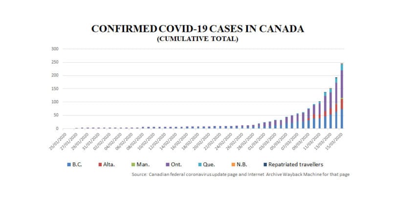
On Saturday morning, I looked at the federal government’s official federal coronavirus website and noticed that the number of confirmed COVID-19 cases had jumped; I wanted to update my story for Maclean’s on a province-by-province breakdown of advice and requirements to deal with the virus. The cumulative total of confirmed cases was 153 on March 12. On March 14 it was 193. (Update: as of Sunday morning, it stands at 249.)
That got me curious: what does "the curve" look like for Canada? How quickly has our national case count changed over the past few weeks?
Related Posts

Canada’s Flu Seasons Are About to Get a Lot Worse

The Smart Case for Private Health Care
Sometimes there’s nothing like charts to explain a story in simplest and clearest terms. Yet when I looked online, I couldn’t find a Canadian version of those familiar curves showing the change in case numbers over time in China, Italy and South Korea. Health Canada’s official coronavirus webpage contains only the current tally, which is gathered and compiled by the Public Health Agency of Canada.
So, to get a sense of how things have gone since the first case was reported in Ontario on Jan. 25, I asked Health Canada on Saturday for that historical data. But the ministry wouldn’t release it. "The provinces and territories are the owners of the information," said spokesman Eric Morrissette in the media relations department for both Health Canada and the Public Health Agency of Canada. The ministry won’t even provide yesterday’s data.
This is not as trivial as it might sound. As case counts rise around the world, and governments make life-changing decisions based on those numbers, access to this information in its most digestible form is vital for the public to understand what’s happening. Short of waiting until Monday to start contacting all 13 provinces and territories, there seemed no other way to see how the tally had changed. Not from government sources, at least.
I turned, then, to the Internet Archive Wayback Machine, which trawled the Internet taking captures of web pages from sites all over the world. Using the Wayback Machine’s 82 captures of the federal coronavirus page from Jan. 25 to March 14, Maclean’s was able to chart the spread of COVID-19 in Canada. In the last 50 days, the number of cases has grown from one in Ontario to the cumulative total of 193 confirmed cases in six provinces currently displayed on the Health Canada site.
Still, lacking a corroborating, government-published version, we wanted expert perspective. The overall numbers remain low compared to other countries. Is it too early to read anything into Canada’s growth curve?
We asked Dr. Isaac Bogoch of Toronto’s University Health Network, who specializes in emerging and re-emerging infectious global health threats, to look at the chart. "There are no surprises." he said, while looking at the graphic. "It shows how we are so interconnected."
"We were, for a period of time, getting very rare exported cases from China and then, gradually, as the infection started to march around the world and as countries reported their first cases, we started importing cases from more and more places, including Iran, Italy and now the United States."
What interests him is how the curve may change in the future. "We just enacted social-distancing measures. We’ve cancelled many schools, universities, hockey. It had to be done. It’s extremely important," he notes. "See that rise in the curve? Now the goal is to see if we can level that off, and not get a peak by practising social distancing."
That means involving everyone. "By truly implementing social distancing, we can take the Japanese or South Korean curve [which has flattened in recent days] rather than the [steep, deadly] Italian curve." Many places, especially in the public sector, have done their part by closing facilities and cancelling events. Now, Bogoch believes, what’s left is the private sector, who have to facilitate measures that will help bring the caseload down.
Canada is at a crossroads. Can we stay off the path of the destructive curve?
MORE ABOUT COVID-19:
- Coronavirus in Canada: Should you shame friends into cancelling their vacations? (And 17 other urgent questions)
- Would Donald Trump ‘take responsibility?’ No way, not on Oval Office Opposite Day
- The unbearable lightness of Donald Trump in a coronavirus crisis
- Books to spark or allay our fears in the time of the coronavirus pandemic
Related Posts

A Doctor’s Plea for Civil Discourse

AI Could Save Canada’s Health-Care System

Canada Needs a National Vaccination Registry

The Secret Weapon in Canada’s Sewers
Get the Best of Maclean’s straight to your inbox.
Sign up for news, commentary and analysis. Join 60,000+ Canadian readers.