charts
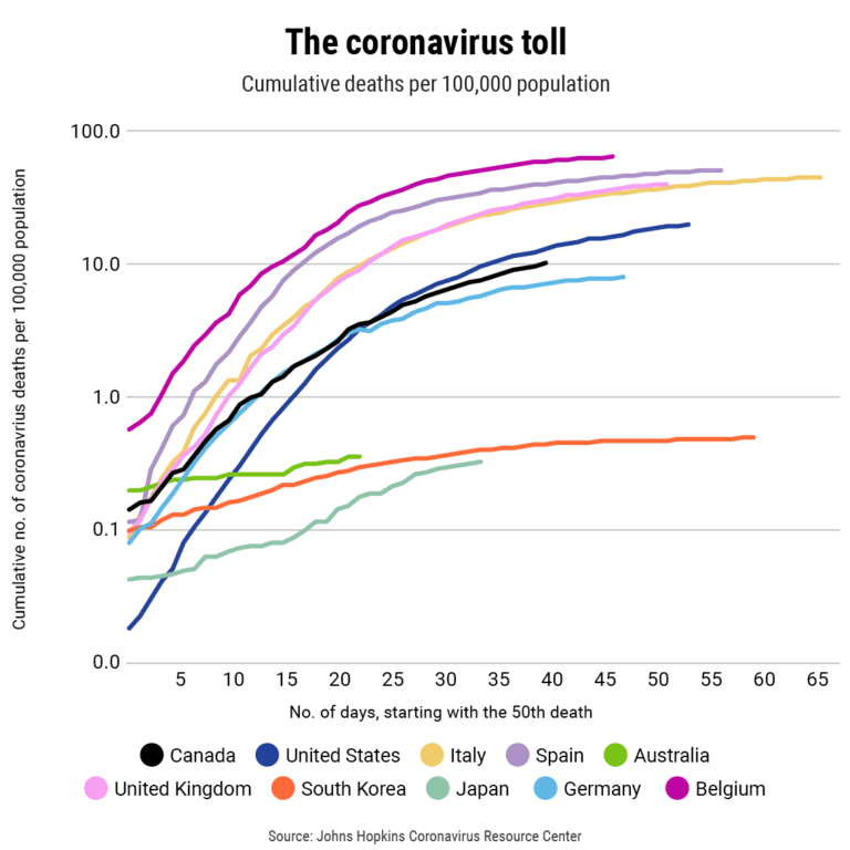
Coronavirus deaths: These charts show how Canada compares with the world
When you adjust for population, we’re doing a little worse than Germany—and only a bit better than the United States
The most important charts to watch in 2019
Our fifth annual bonanza of more than 70 charts to help you make sense of the economy in the year ahead
The 91 most important economic charts to watch in 2018
For the fourth year in a row Maclean’s presents its year-end Chartapalooza, your guide to making sense of the economy in the year ahead
75 charts every Canadian should watch in 2017
Maclean’s presents its third annual chartstravaganza to help make sense of the Canadian economy in the year ahead
The most important charts for the Canadian economy in 2016
From employment and trade to energy and deficits, here are 50 charts picked by Canada’s brightest minds to help you understand the economy in the year ahead


