Coronavirus deaths: These charts show how Canada compares with the world
When you adjust for population, we’re doing a little worse than Germany—and only a bit better than the United States

(Patricia Treble and Lauren Cattermole)
Share
As the number of people who have died from COVID-19 passes 250,000 in the world, the relentless climb of infections and deaths can be almost too much for people to comprehend. For instance, it took roughly a decade for 58,220 Americans to die in the Vietnam War, yet COVID-19 killed at least that number in two months.
Canada is in its ninth week of self-isolation. Since the nation’s first death was recorded in British Columbia on March 8, roughly 4,000 people in this country have died of COVID-19. In the beginning, the numbers were shooting up by more than 100 per cent weekly. But in the last two weeks, those increases have slowed. The week of April 19 to 25 saw a 22 per cent increase to 1,025 dead for the week from 838 in the previous week. The next week, April 26 to May 5, another 1,102 deaths were recorded. While the numbers are brutally high, they have largely stabilized, at least for the moment.

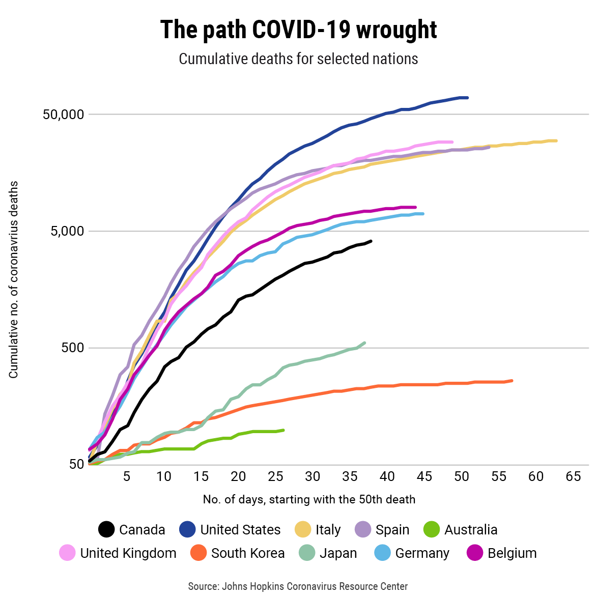
That overall death toll as of May 5—4,000 have died in Canada—may look small compared to the 70,000 dead in the United States, but that huge gap narrows significantly when the cumulative number of deaths for those two nations are plotted in a logarithmic chart, along with those of selected nations that have their own stories to tell. Such charts are good for identifying trends when dealing with the exponential growth of the virus, and its deaths, especially among jurisdictions of varying population sizes. As well, by picking the same starting point in the epidemic for every nation, the charts allow comparisons between countries further along in their outbreaks, such as Italy and Spain, with countries that could see what was happening in those nations and shut down earlier.
For instance, Canada’s death rate—largely the result of deaths in long-term care and seniors’ facilities—is growing much faster than those in South Korea, Japan and Australia, which have slowed their outbreaks dramatically. Indeed, Canada’s curve is just below that of Germany, which has the sixth largest outbreak in the world but has been able to avoid having its hospitals and medical systems overwhelmed like those in Italy and Spain. In part, experts believe, that’s because a massive campaign of testing and contact tracing meant known cases could be identified, isolated and given treatment before the carriers became seriously ill.

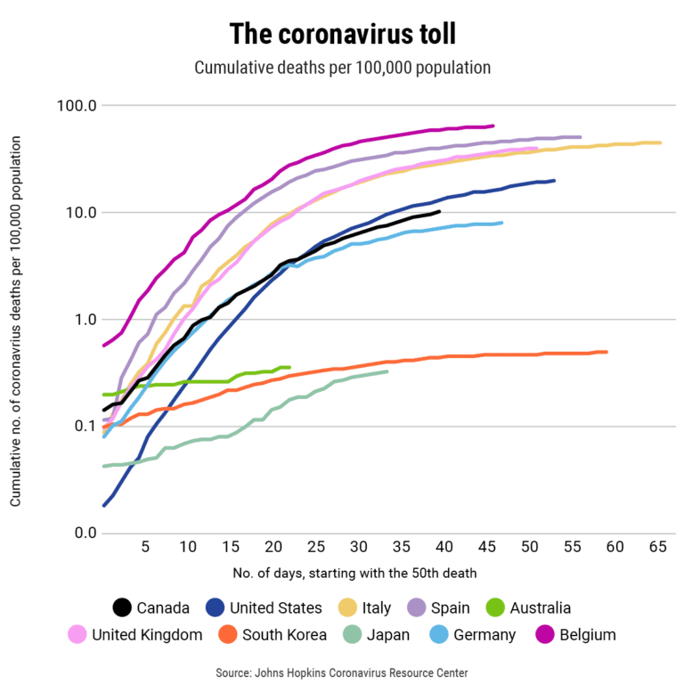
Another way to look at deaths among nations is to equalize for their population differences, by crunching the cumulative death data on a “per 100,000 population” basis. It’s the same way crime data is standardized so murder rates in Toronto and Halifax can be compared on an “apples-to-apples” basis. And that’s where things get interesting. For one, Canada’s death rate is mirroring that of Germany far more closely when population is removed as a factor. As well, and far more ominously, Britain appears to be following the deadly path carved by Italy, while the steep and sudden rise in U.S. deaths is unmatched among other nations with serious COVID outbreaks.
However, the charts are only as good as the data. And the experts all admit that the current data isn’t likely telling the entire tale of the COVID-19 pandemic. In particular there is the disturbing spike of “excess deaths” in many nations, determined by looking at the historical average of deaths for this time of year, and then plotting the number of actual deaths in 2020 for the same times. According to the Financial Times, which has done so much of the data sifting, there are 153,000 more deaths than usual in the 21 nations it is tracking, including 58,000 above reported COVID-19 deaths. That dichotomy suggests that the death toll of COVID-19 may be far higher than currently acknowledged. (Canada doesn’t provide up-to-date death data.)
Then, there is Belgium, which is presented in these two logarithmic death charts. Its death rate per capita is the highest in the world. The small European nation (pop. 11.6 million) has been very hard-hit by the virus, yet part of the explanation for its high death rate may be because its authorities are including more COVID-19 deaths in its statistics than other nations, in particular, those outside hospitals.
The speed at which COVID-19 has changed the world is breathtaking. Yet, death is always with us, though not from such a pernicious infection. While comparing the two-month COVID-19 death toll to the Vietnam War helps put its toll into perspective, the Washington Post notes that heart disease and cancer each claim around 100,000 American lives in those same two months.