The decline of handwriting? Chalk it up to marketing.
An ‘illustration frenzy’ has taken over marketing, the latest in a trend of ‘faux sincerity’
Share

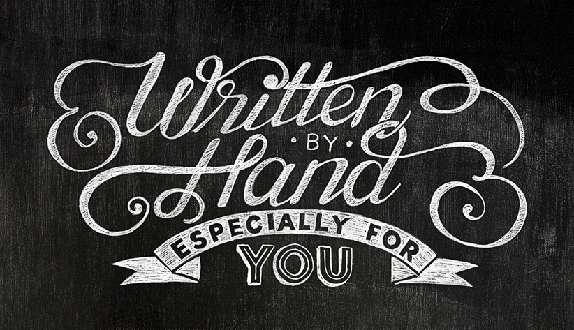
A lot of ink has been spilled over the decline of handwriting, with cursive, in particular, all but vanished from the curriculum. (Some schools have adopted “cursive clubs.”) But there’s one place where handwriting is thriving. A whimsical handwritten script has become marketers’ method of choice to telegraph authenticity. Billboards advertising “natural,” “homestyle,” “local,” or “farm-raised” products in handwritten fonts are ubiquitous. The chalkboard aesthetic reigns at fast-food restaurants such as Chipotle, and at grocery chains, where it gives the impression of health and wholesomeness—but equally so on Pinterest, which is chock full of chalkboards. (They’re very popular at weddings, where they’re used to display seating charts and menus.)
Almost every coffee shop—independent or not—features a quirky chalkboard with folksy exhortations. David’s Tea, an upscale Canadian shop, lures customers inside with its signature teal-blue sandwich board, marked up with intricate drawings of celebrities and puns underneath: “George Cloontea.” “Teayoncé.” The coffee behemoth Starbucks likewise incorporates handwriting on its corporate-issue chalkboards, featuring seasonal latte specials and words of wisdom. Even Toronto Hydro recently sent out a booklet to consumers exhorting “DIY savings” in a bevy of vintage, curly scripts. (The cover, which shows cozily lit Mason jars bundled in yarn, promises to teach readers how to make an LED lamp.)
Handwriting has become a way to personalize a brand, to make it seem authentic and unique. Millenials “want to avoid prepackaged, preprocessed anything,” says Alan Middleton, assistant professor of marketing at York University’s Schulich School of Business. Middleton also sees the explosion in handwriting and illustration on corporate paraphernalia as part of a growing trend in “deformalization.” Businesses increasingly speak to consumers in informal language, instead of the stiff, authoritarian tones of old. The visual equivalent is using emoticons mixed in with text, or “roughed-up copy,” Middleton says, to create visual interest and draw in Millenial consumers. That Hydro pamphlet features doodles, starbursts and arrows.
Michèle Champagne, a Toronto-based designer, says there’s “an illustration frenzy” in bank marketing right now, where “everybody has Porter envy” after witnessing the success of the airline’s now-ubiquitous raccoon mascot. “And every hipster, neo-Victorian bar has this young man come and do the menu by hand in chalk,” she adds. It’s a trend in “faux sincerity.”
New technology makes it easier to employ script that looks like handwriting without putting pen to paper. Computerized fonts can morph each letter and symbol, based on where it falls within a word or phrase, lending the writing a more natural flow, says Thomas Phinney, president of FontLab, which makes programs that build and edit fonts. Phinney, who grew up in Edmonton, points to the Bickham Script typeface. This graceful script offers multiple versions of each letter. (Even the capitals have variants.) “It looks like real calligraphy,” Phinney says. “It’s used on a lot of wedding invitations.” Caflisch script, he continues, is more casual, and “looks like it was done with a thin felt pen.”
Julia Sysmäläinen, an award-winning Finnish type designer who lives in Berlin, has upped the ante by making typefaces that evoke the handwriting of Franz Kafka and Emily Dickinson. Although she laments handwriting’s decline, she sees it as a boost for script typeface: “It becomes something like artwork.” Mister K, her Kafka-inspired typeface, has appeared on Kafka book covers. The current interest in the handwritten has produced some truly innovative ideas: Barcelona-based Arrels Foundation has created a suite of typefaces called Homelessfonts, based on the handwriting of the homeless in that city.
Still, some products should stick with a stodgy look. Middleton invites us to imagine a whimsical chalkboard advertising not single-origin coffee, but flying lessons. Charm and quirkiness suddenly aren’t so appealing.