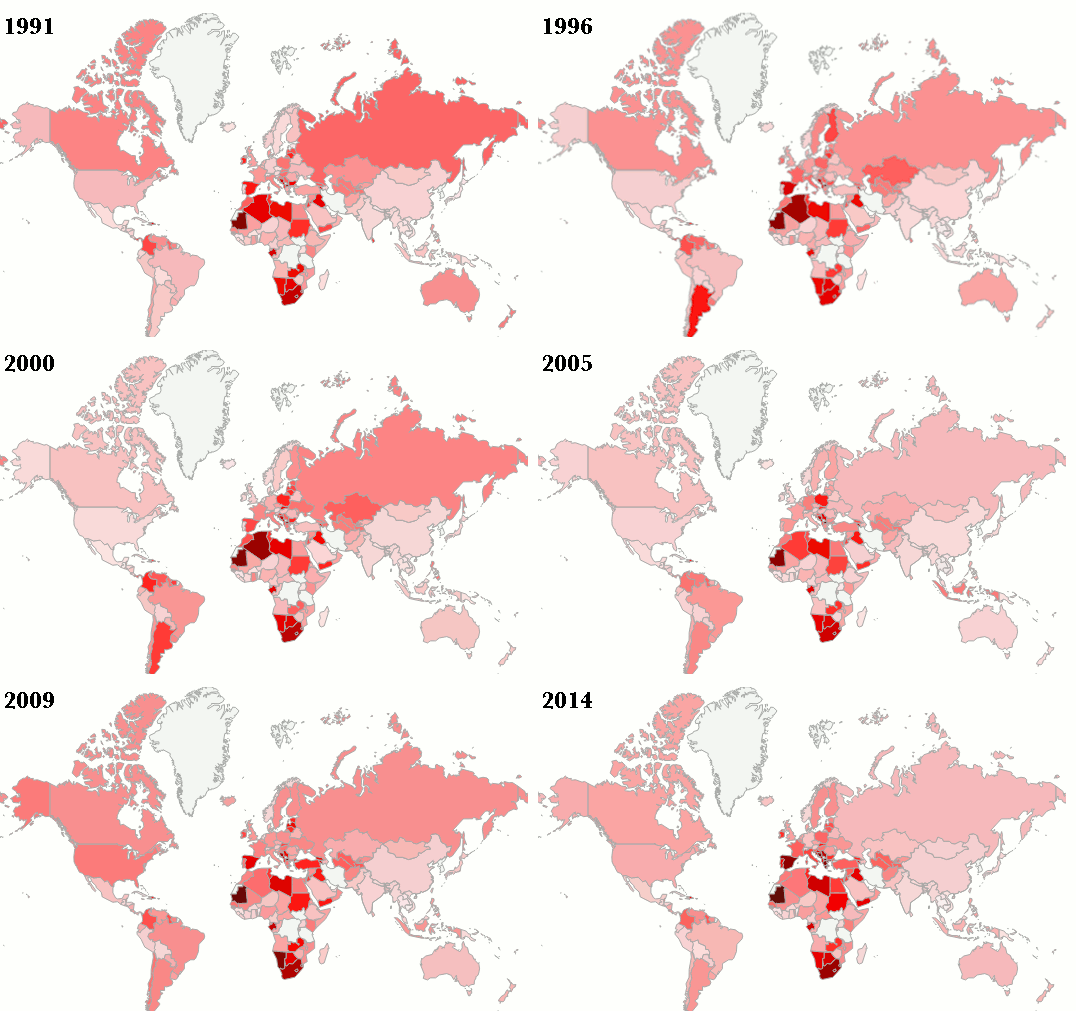
Watch 23 years of global economic change in 30 seconds
Despite disappointing job growth, Canada seems to be doing pretty well on the global unemployment front.
Share
The latest Canadian job numbers came out last week showing the country created just 200 new jobs in July. That’s a stunningly disappointing number considering analysts were expecting closer to 9,400 jobs. (Update: this number now seems to be wrong and Statistics Canada has said it will release revised figures on Friday and conduct an internal review into its data verification process.)
Over the past 12 months the economy has managed to churn out just 115,000 new jobs, virtually all of them part time. That has sparked growing concern that Canada’s strong economic recovery since the 2009 recession is coming to an end. One popular explanation for slowing job growth at home is that Canadian businesses are still struggling to boost exports in the face of the ongoing sluggish global economic recovery.
Every year since 1991, the International Labour Organization has published a map of global employment trends, which allows us to see what has actually being going on in the global job market over the past 23 years.
We’ve compiled their annual maps into a handy animated gif, one which shows pretty clearly just how truly global the 2009 recession turned out to be and the slow, uneven recovery that has followed. The darker the country, the higher its unemployment rate that year:
The Canadian story is pretty obvious. It’s one in which we’ve steadily recovered from the 1990s recession, aside from a fairly short-lived contraction in the early 2000s, only to be hard hit once again in 2009. It’s taken jobs awhile to recover since then, although it also took a better part of the decade for Canada to pull itself out of slump of the 1990s. Notice, however, how the American unemployment rate appears to have recovered faster in the past two years than Canada’s, albeit from higher levels of unemployment.
Then there’s the rest of the world. Europe shows up unfortunately small on this particular map. But a few things stand out over there: One is just how much Europe has come to rely on Germany as its economic engine. The other is the tiny sea of dark red in Southern Europe that encompasses Greece, but also neighbours such as Albania, Croatia and Bosnia (along with Spain.)
It’s also clear in studying the changes since 1991 that the European economy has never been that deeply integrated despite the expansion of the European Union and the transition to a common currency among its members. In fact, the few years just before the global crash — 2007 to 2009 — was about the only period when most of the job markets of Europe seemed to grow all together at the same time.
When it comes to Latin America, the continent appears (so far) to have put the worst of its economic crises behind it in the early 2000s. Russia has likewise posted a fairly dramatic recovery since the fall of the Soviet Union and the economic collapse that followed. China’s official unemployment rate has sat virtually unchanged, between four and five per cent, over past 23 years. (So much as anyone wants to trust the official numbers.)
Africa, meanwhile, has also seen comparatively little change in the unemployment rate across the continent over all these years. For instance, South Africa had a 24 per cent unemployment rate in 1991 and it’s got a 24 per cent unemployment rate today.
The story of the global economy today is one in which some countries, Canada among them, have been slowly recovering from the Great Recession, while others are either still struggling with longstanding economic problems or benefiting from existing strengths. Despite pretty disappointing job growth over the past year, Canada seems to be doing pretty well on the unemployment front. But it’s also obvious that we have yet to fully recover.
Check out the data in more detail, including the actual global unemployment rate over the past 23 years, over at the ILOs Global Economic Trends Report.
